A family-owned cannabis company in New Jersey needed a brand identity that could compete with larger players and appeal to an affluent consumer. The existing cannabis visual landscape offered two dominant aesthetics: dispensary-clinical or counterculture-casual. Neither served the audience they were building for.G's Trees — Brand Identity & Strategy
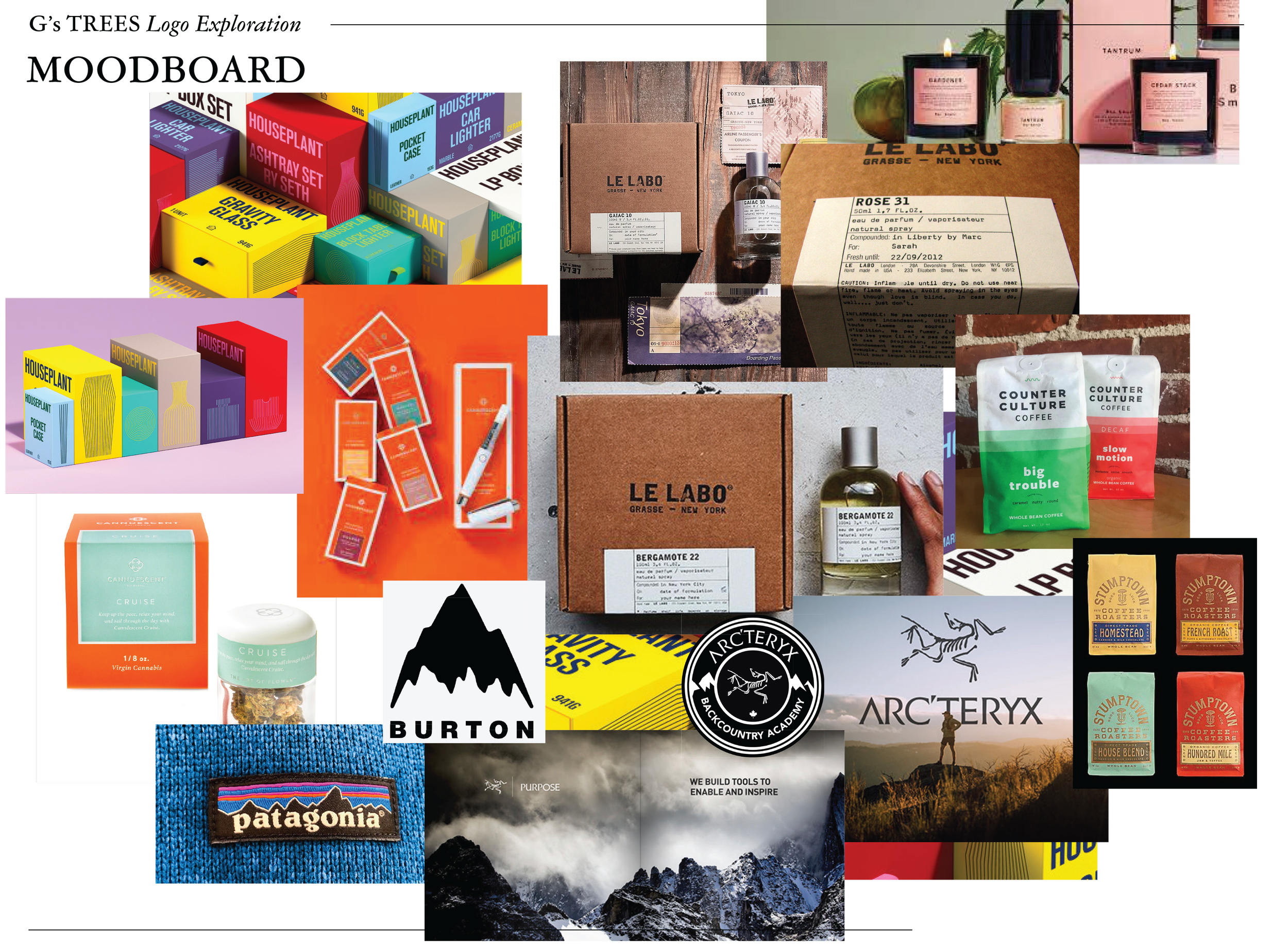
The approachRather than defaulting to a single direction, we developed three distinct strategic territories, each anchored to a genuinely different brand positioning: psychedelic pattern, bold luxury, and constructivist athletic. None of them reflected personal aesthetic preference. All of them were built to serve a specific audience and a specific market position.
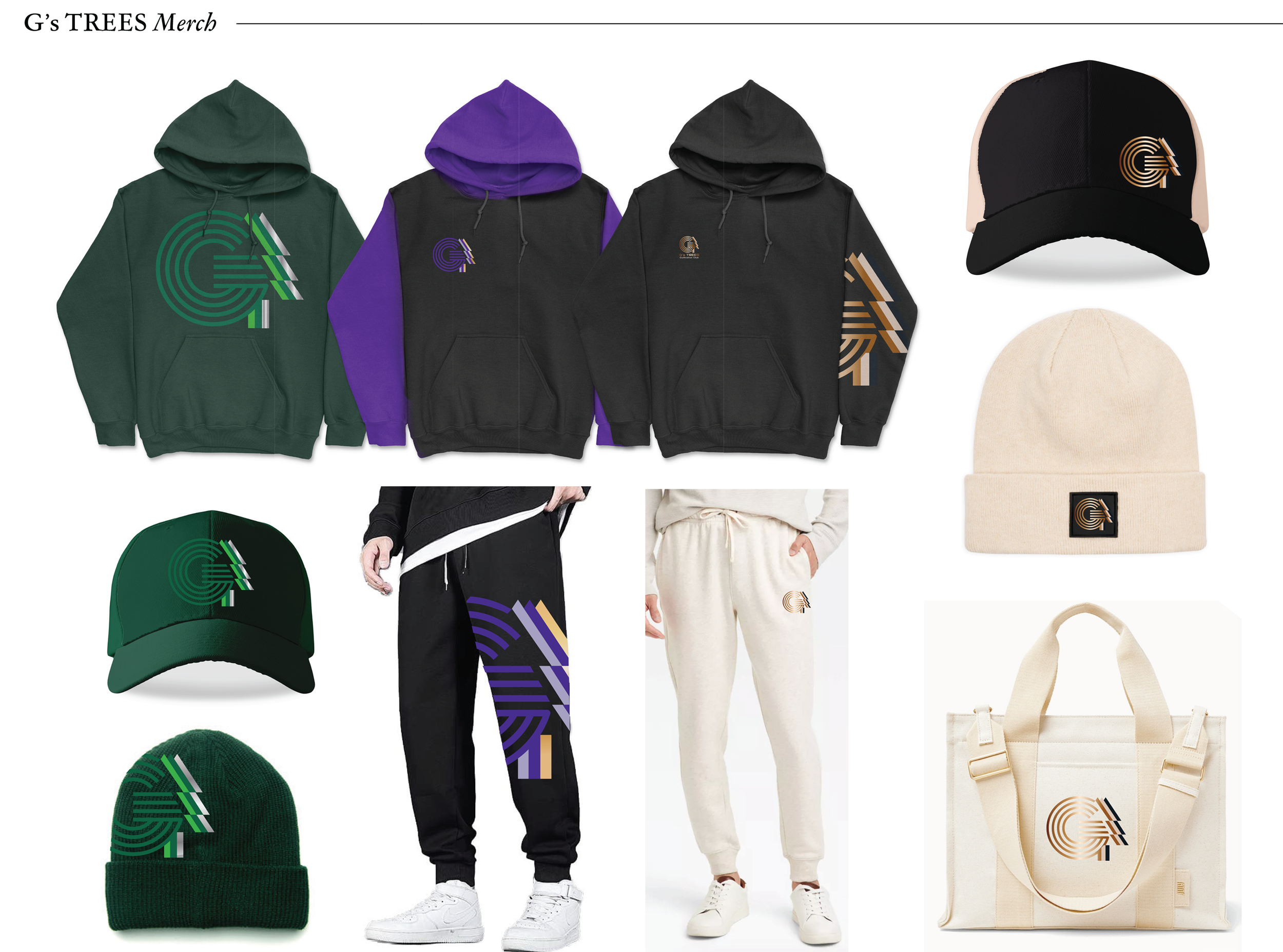
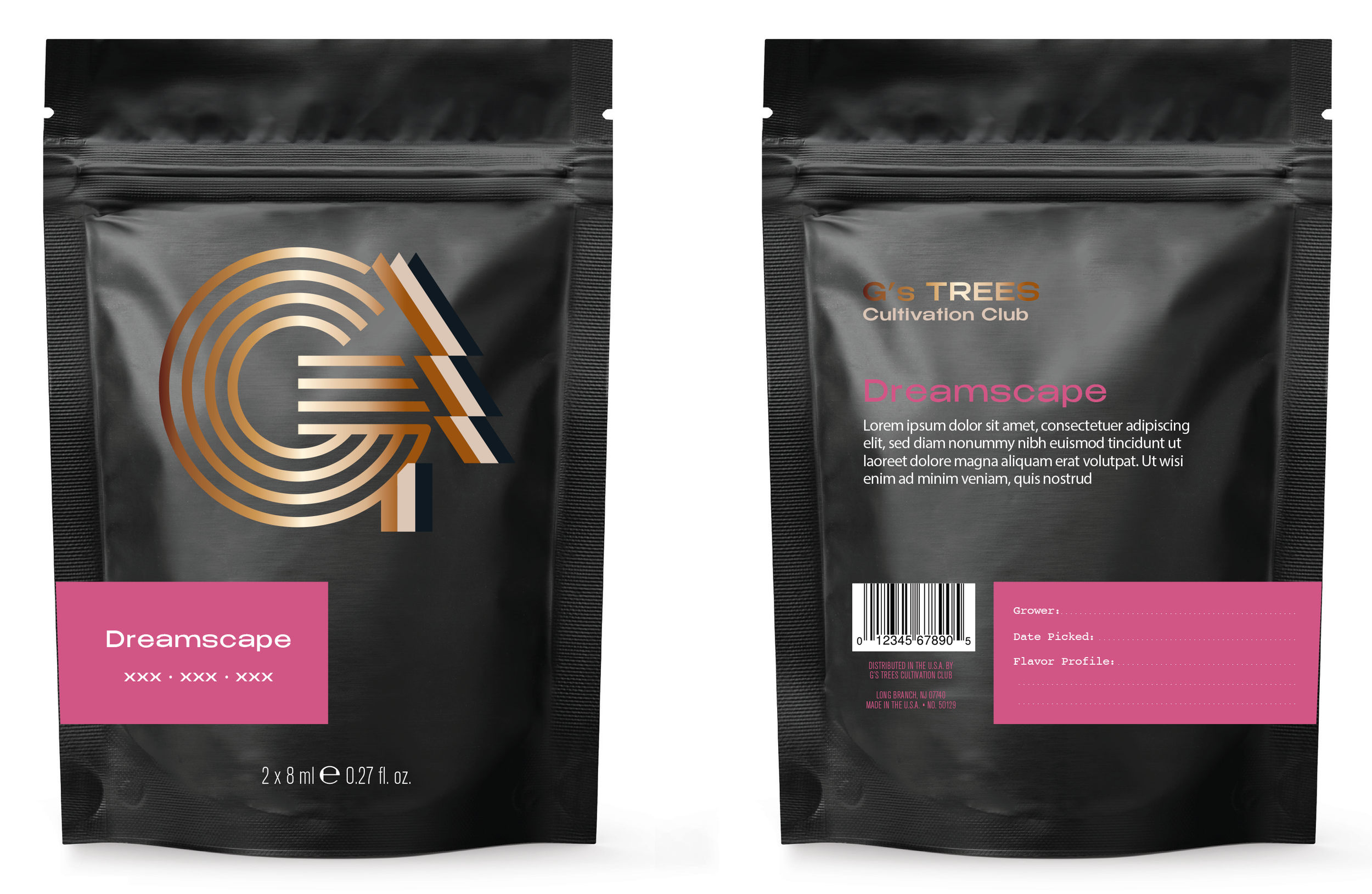
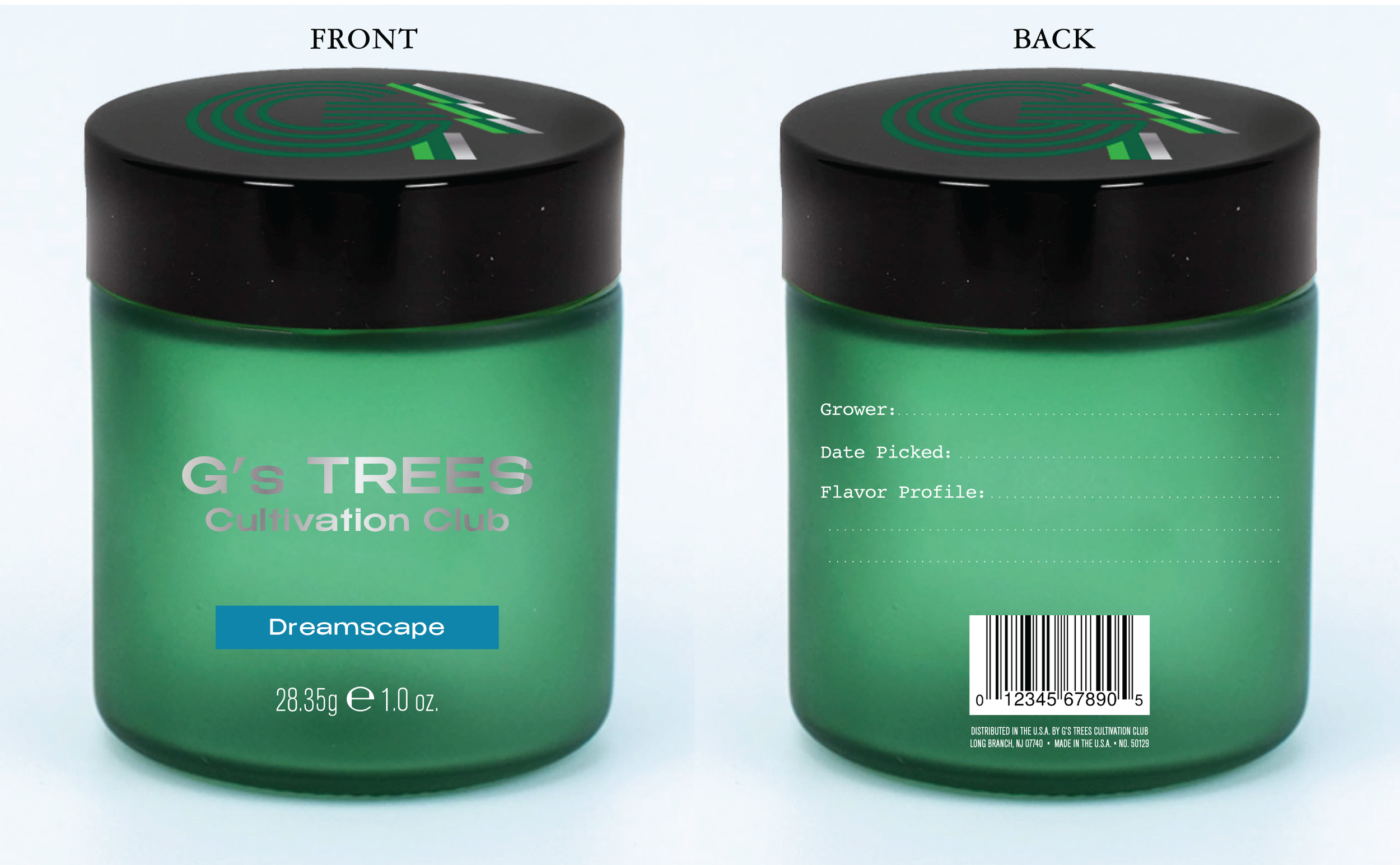
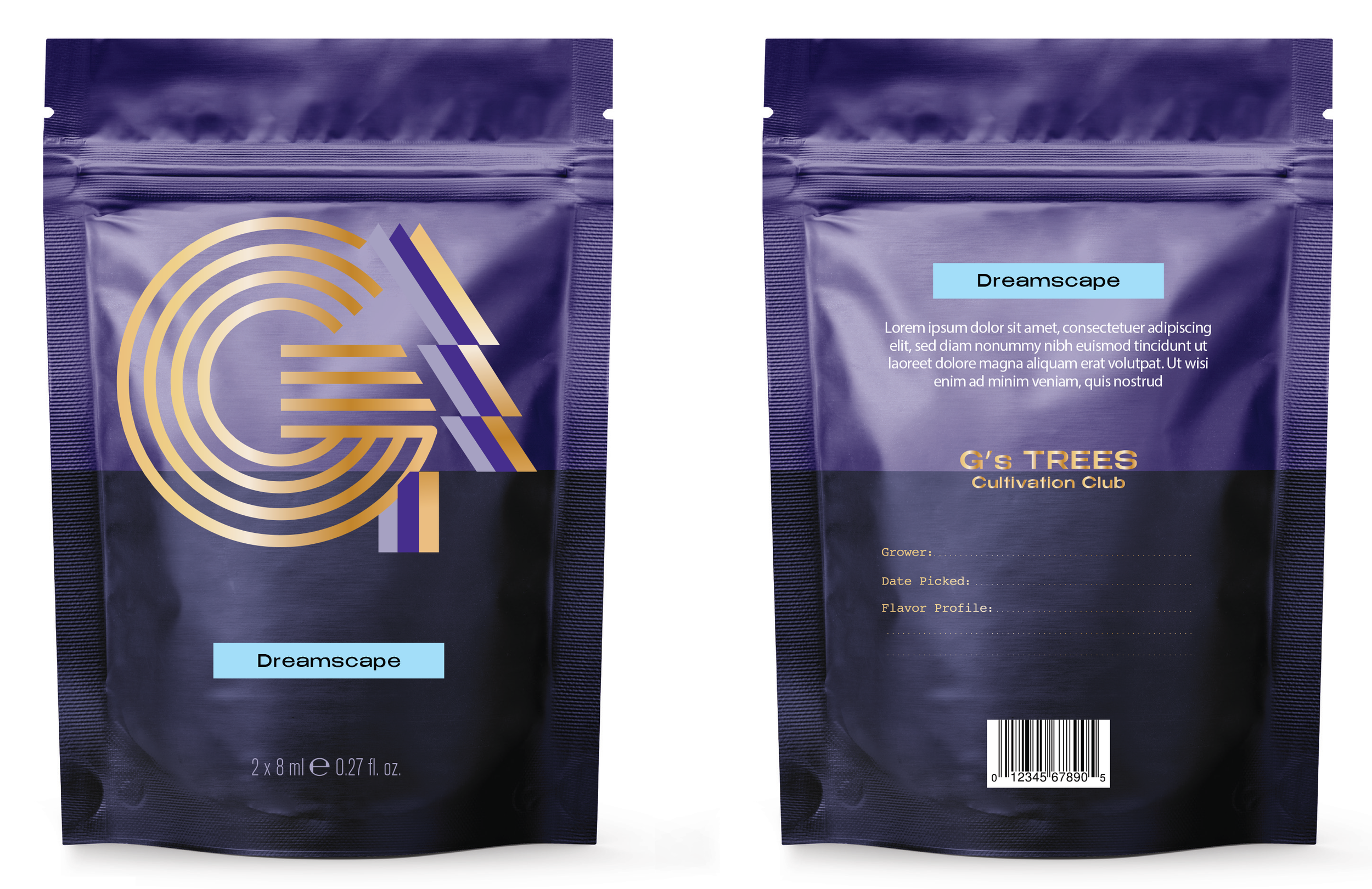
The client chose the direction that matched their vision. The final identity used geometric letterforms and a palette of gold and neutral tones to signal quality and create room for lifestyle applications well beyond the product itself.
What was delivered:
• Brand strategy and positioning
• Logo development
• Packaging design
• Merchandise concepts
• Brand guidelines
The result:
A brand identity the client described as feeling like it came from inside their own head — specific, considered, and built to grow.